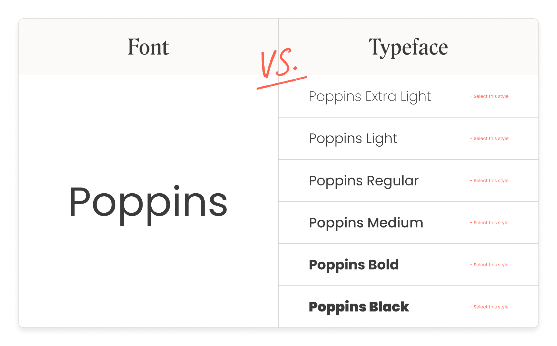

There are instances when what should be called a typeface is named “font families” instead. It’s all about the looks, not the technicalities.įonts have grown far beyond their original definition in typography. Whether it be a business letter, a birthday card, an email signature, or even logos for personal use, the font has been the embraced term for the letters. The regular end users or consumers only care for what the letters will look like when creating their files. From the programmers who made the word processors and the typographers who create these letters on computer screens, they are working on typefaces. Pulling up any word processor and the program has dropdown lists for fonts, their sizes, weights and, styles. Process and output were merged when technology has presented mastery of computing. They became computer codes that can be altered by the user to a desired size or weight. Printing was no longer exclusive to a profession with the advent of machines that can be set up at the comfort of one’s home.įonts are no longer imprinted on paper using thousands of tiny metal blocks. There was little need to differentiate the mechanic from the end result when desktop publishing became widely available. One typeface can have several fonts based on the intended final product that the printing press needs to meet. With that being said, Medium Times New Roman 12-point is a different font from Bold Times New Roman 24-point. These refer to the size, style and, weight of the typeface to be used to get certain effects out of print. Fonts are used to describe the subsets of the typeface.

Taking the example from the previous paragraph, Times New Roman is the typeface: this covers all of the metal blocks the printers will use that share the same basic design aspects. Where do typeface and font come to the scene then? 12-point, 14-point, 22 point and, so on) and weight (light, medium, bold). If you are to print in Times New Roman, you’ll have to have different blocks for every size (e.g. These characters set out in relief were called type faces. Making a page required these tiny metal blocks by the thousands – each with the letter it was supposed to show. These letters were loaded in ink and were pressed onto clean paper surfaces this was part of the page layout process. Pages were painstakingly set out in frames with metal letters during the days of analog printing.

It is commonly-accepted in today’s conversation that font and typeface are almost one and the same.īut looking at it from the technical side of things will point out a few differences. This has been the case of the font vs typeface debate – terms that are now interchangeable by today’s standards.Ī beginner or a complete layman to the world of type treats these words as synonymous, much to the annoyance of typography experts or those who are familiar with the field. The demands of industries that come and go tend to take the origins of words with them.

Our society progresses and the way certain words are used differs when a lot of outside factors are involved. Time has been shown to change the meanings of words.


 0 kommentar(er)
